
In fact, I think I originally stumbled on Orlygg's seminal blog a few years back looking for shield designs and his recent post (putting the faces on armour - GENIUS!) inspired me to finally have a go at it.
So, here's my very first Oldhammer shield design:
 |
| Anyone hungry for Frankenberry cereal? |
I didn't closely follow any directions, or add as much detail as Orlygg's designs, but just by swirling paint around, blending in white and slowly drawing out the shape of the face was much fun. The face sort of grew out on it's own, organically. Try it, you'll see what I mean!
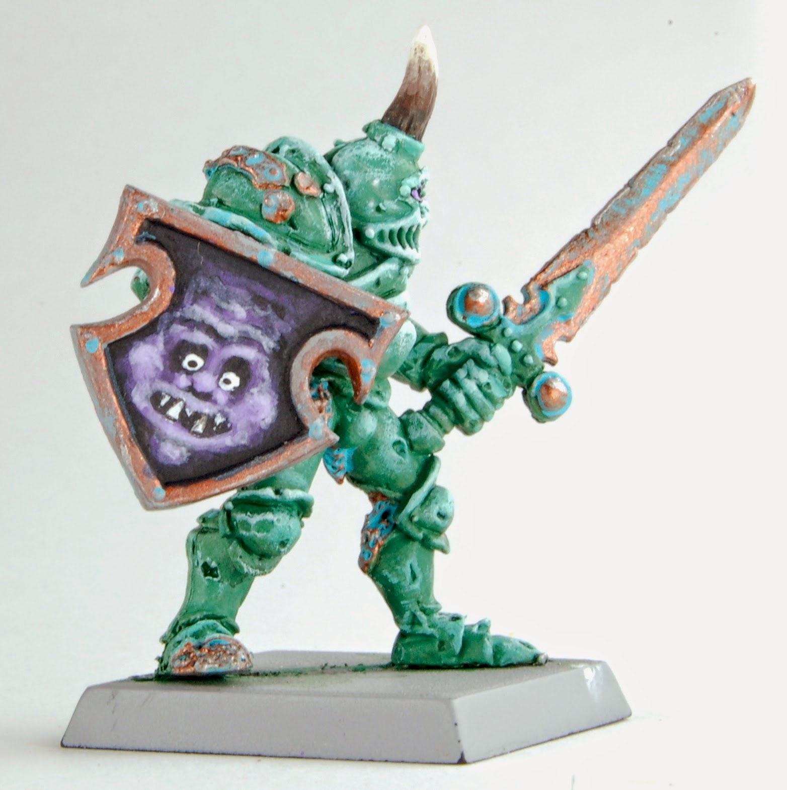
Here's some more shots of the nurgley Chaos Champion, now sporting the shield in order to strike fear in the hearts of his enemies.


OK, so in trying to get all 'Eavy Metal on his you-know-what, I overdid the highlighting (looks like I painted with chalk) and I also overdid the verdigris effect. But, I swear he looks better in person. Maybe he just needs a better background?
 |
| Does this background make me look fat? |
Next up, experiments with glazes to correct chalky highlights. Tips and recommendations appreciated!
I looks good, really, the purple/verdigris combo is excellent.
ReplyDeleteTo avoid the chalky finish of the highlight, I would have 2 advices :
- thin your paint until it's like milk, you will apply it and the base colour will show through it, highlight with the base colour lighted with a bone colour or something like a light yellow. as you highlight like this you can always add more bone or yellow and apply the highlights to more and more reduced parts until you're happy with it. thining the piant a lot allows you to add multiple layers without getting that chalky finish and it blends the colours naturally.
- Try using a wet palette, it's extremely simple to build one for yourself and it can change your life when you're working on such armours, it enables you to keep yor mix fresh and to light it up as you go so you never have to make more during the process, it also keeps your paint fluid and to get this milky touch to it.
very cool work anyway !
That is an awesome shield! I actually like how the champion turned out. It is quite a unique painting style. I personally wouldn't change anything...but to each his own. Thumbs up from me though.
ReplyDeleteP.S. Love the blog banner.
Looks good on both the shield and the figure. I personally am still trying to get my head around glaze versus wash. In some regards it sounds like it's more what you're trying to do with the paint as they are both essentially thinned. I will also say that the background can make a big difference in the look of the figure. My personal bias is against white or light backgrounds.
ReplyDelete